
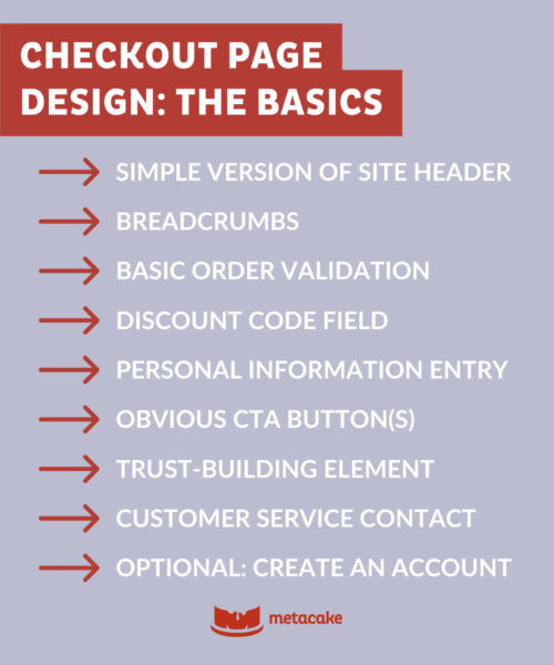
How to Design Better CTAs, Forms, and Checkout Flows
A good checkout experience should feel clear, fast, and low-effort. Based on the sources, the main goal is to reduce friction and help shoppers complete purchase with confidence.
1. Design CTAs that are clear and obvious
Your call-to-action should tell people exactly what happens next.
Best practices:
- Use specific copy like “Proceed to Checkout”, “Complete Purchase”, or “Continue to Review”
- Make the primary CTA visually stand out with strong contrast
- Keep competing buttons or distractions to a minimum
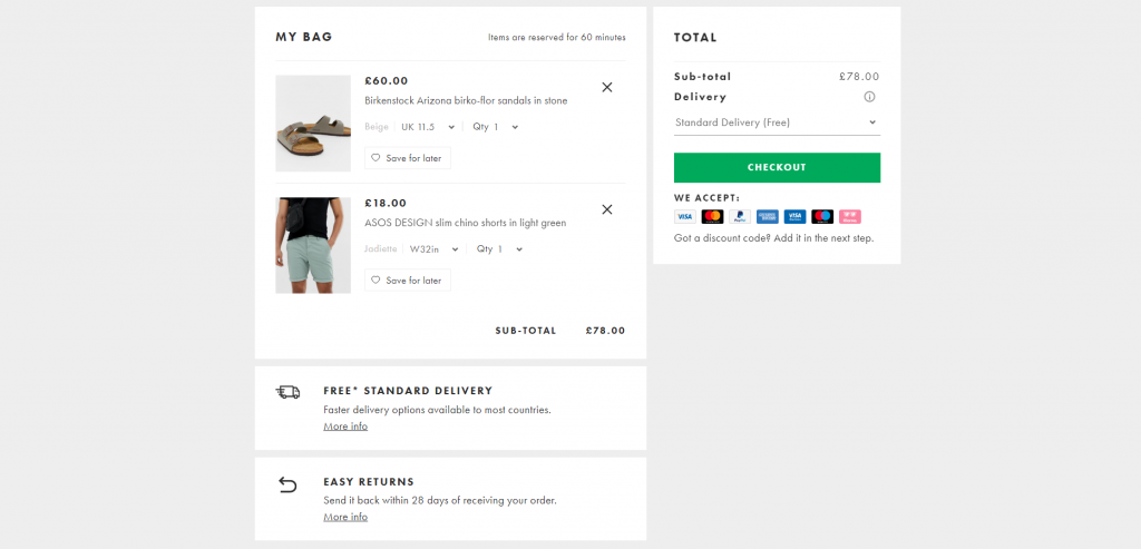
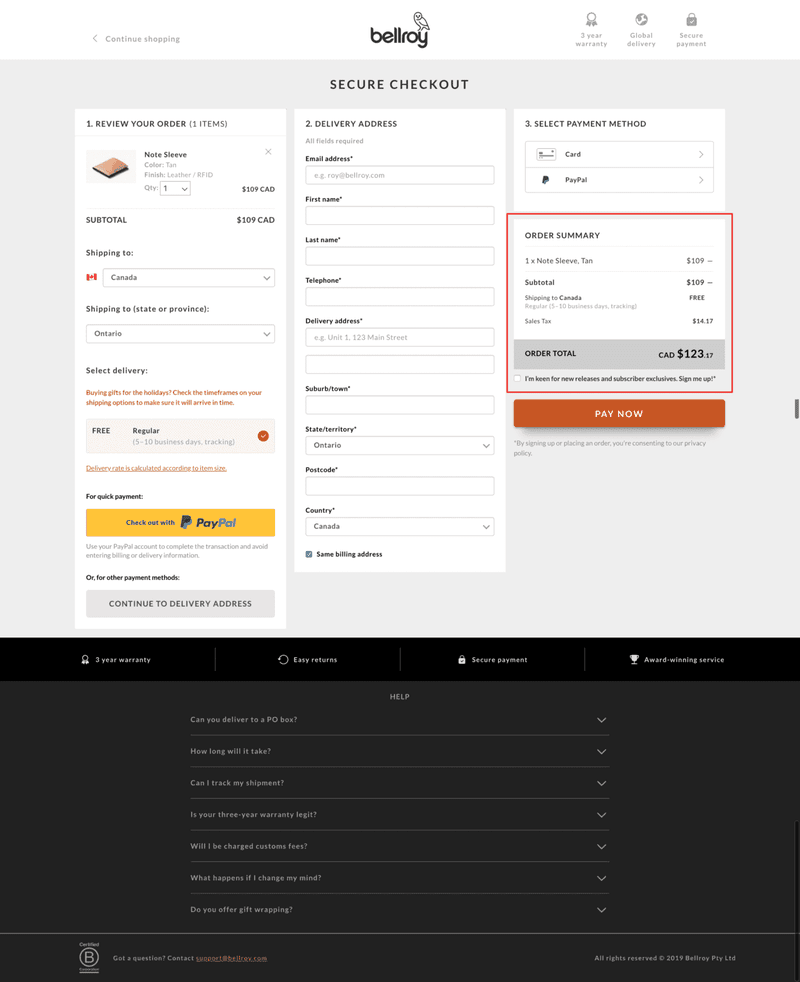
- Place CTAs where users naturally look, such as near cart totals and at the bottom of the page
- Test different CTA labels to see which one converts better
Avoid:
- Vague labels like “Continue” or “Save & Continue”
- Buttons that blend into the page
- Too many equally prominent actions
2. Simplify forms as much as possible
Forms are a common source of checkout abandonment. The fewer fields people need to complete, the better.
Best practices:
- Ask only for information that is truly necessary
- Reduce form fields to the minimum
- Use autofill and smart address prediction
- Validate errors in real time
- Let users use the same billing and shipping address with one checkbox or toggle
- Explain why certain fields are needed if they may feel intrusive
Helpful tactics:
- Combine fields where possible
- Remove optional fields that do not add much value
- Use clear field labels and placeholder text
- Optimise forms for mobile users, where typing is more tedious
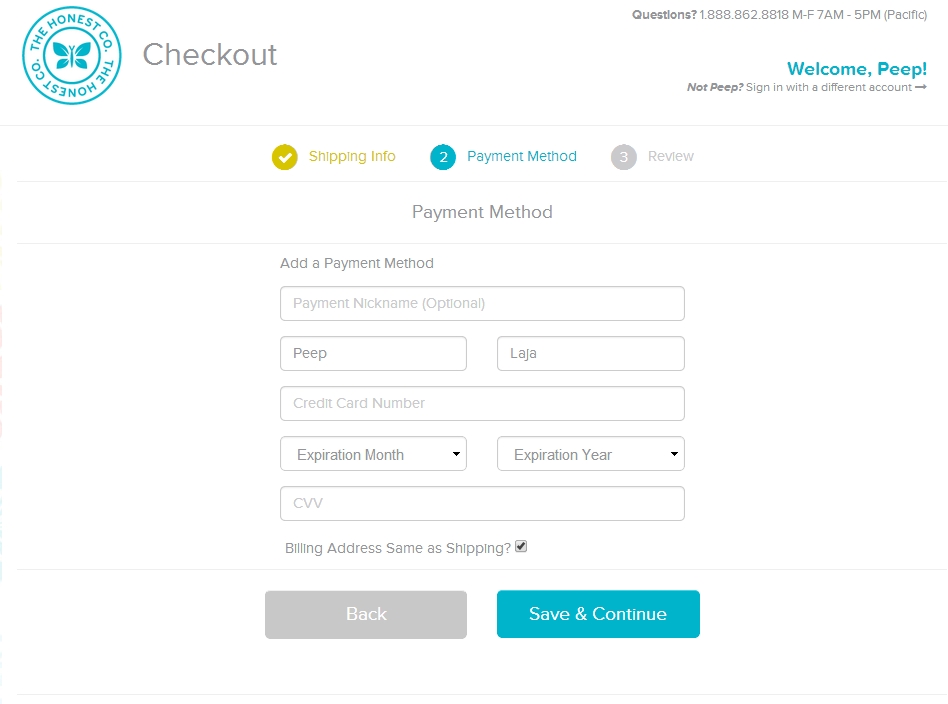
3. Make the checkout flow easy to follow
A checkout process should feel structured, not confusing.
Best practices:
- Use a simple step flow if there are multiple stages
- Add progress indicators so users know how far they are from completion
- Ask for the easiest information first
- Show totals, shipping, and taxes early to avoid surprises
- Allow guest checkout so users do not need to create an account before buying
Avoid:
- Surprise costs at the end
- Too many pages or unnecessary steps
- Forced registration before purchase
- Poorly named buttons or unclear next steps
4. Reduce distractions and keep focus on purchase completion
The checkout page should have one main job: help the user finish buying.
Best practices:
- Remove ads, promotions, and unrelated links
- Keep visual hierarchy focused on the checkout action
- Make cart editing easy without forcing users to restart the process
- Keep cart contents persistent so users can return later
- Offer save-for-later or cart recovery options
5. Support mobile and trust-building needs
Many users will checkout on mobile, so the experience must work well on smaller screens.
Best practices:
- Use larger buttons and readable text
- Keep layouts responsive
- Minimise typing
- Offer multiple payment methods
- Show trust signals such as security indicators, reviews, or reassurance text near payment fields
Simple checklist for better checkout UX
- CTA is specific and prominent
- Forms are short and necessary
- Guest checkout is available
- Progress is visible
- Total cost is shown early
- Cart editing is easy
- Mobile experience is smooth
- Payment options are flexible
- Distractions are removed
- Trust signals are present
If you want, I can also turn this into:
- a one-page UX checklist, or
- a before-and-after example checkout wireframe.


WebSeoSG offers the highest quality website traffic services in Singapore. We provide a variety of traffic services for our clients, including website traffic, desktop traffic, mobile traffic, Google traffic, search traffic, eCommerce traffic, YouTube traffic, and TikTok traffic. Our website boasts a 100% customer satisfaction rate, so you can confidently purchase large amounts of SEO traffic online. For just 40 SGD per month, you can immediately increase website traffic, improve SEO performance, and boost sales!
Having trouble choosing a traffic package? Contact us, and our staff will assist you.
Free consultation