
Mobile-first design prioritizes creating optimized experiences for mobile devices first, then progressively enhancing for larger screens, while analytics enables continuous improvement by tracking user behavior, identifying friction points, and iterating based on data.
Core Principles of Mobile-First Design
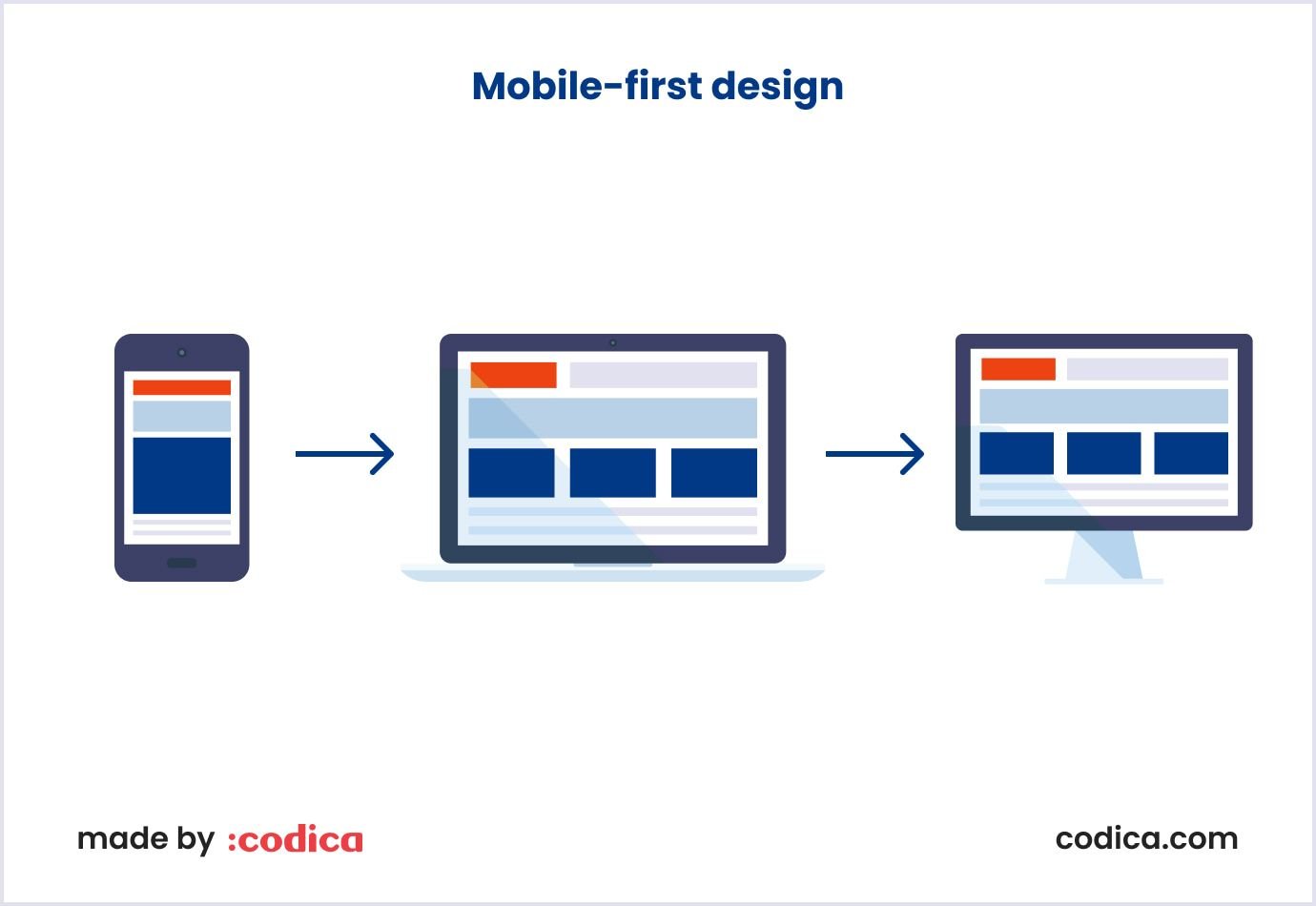
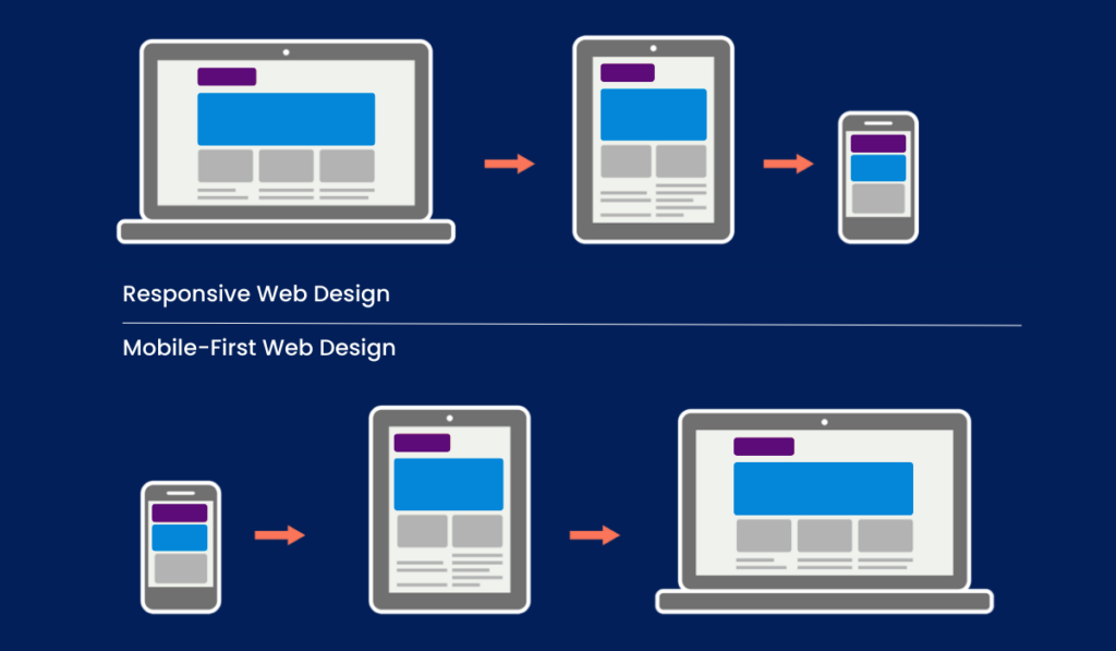
Mobile-first design starts with the smallest screens to focus on essential content and features, eliminating unnecessary elements for clean layouts and optimal performance on limited space and slower connections. Key principles include:
- Content prioritization: Highlight what users need most, forcing designers to understand audience needs.
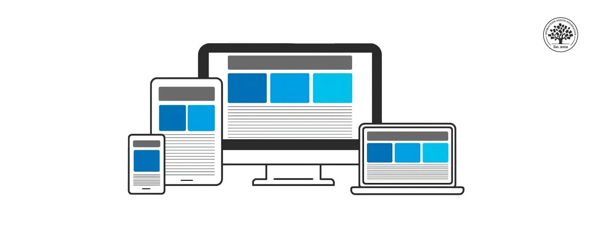
- Progressive enhancement: Build a mobile base, then scale up for tablets and desktops using responsive grids that adapt to screen sizes.
- User-centric focus: Ensure intuitive navigation, touch-friendly interfaces, readable text, and accessibility for all devices.
This approach aligns with progressive enhancement, where core functionality is developed first before adding features for bigger screens.
Key Benefits
Adopting mobile-first drives measurable gains, supported across sources:
- Improved user experience (UX): Simpler, faster interfaces reduce bounce rates and boost engagement.
- Better performance: Leaner code, smaller images, and fewer elements lead to faster load times, especially on mobile networks.
- SEO advantages: Google favors mobile-first indexing, improving search rankings and visibility.
- Business impact: Higher traffic, conversions, and reach in a mobile-dominant world, future-proofing against trends like wearables.
- Accessibility and scalability: Ensures inclusivity for users on any device and streamlines development.
| Benefit | Impact | Supporting Examples |
|---|---|---|
| Faster Load Times | Reduces bounce rates, improves conversions | Lighter assets, no cumbersome code |
| Higher Engagement | Cleaner navigation, intuitive UI | Increased bookings, satisfaction in case studies |
| SEO Boost | Better rankings via mobile indexing | Google's preference for mobile-friendly sites |
Integrating Analytics for Continuous Improvement
Analytics complements mobile-first by providing data-driven insights for iteration:
- Track key metrics: Monitor engagement (e.g., time on page, bounce rates), load times, conversions, and device-specific performance to spot mobile friction.
- User testing and feedback: Test on real devices in varied contexts (e.g., low connectivity), gather early input via prototypes, and iterate prototypes in tools like Figma.
- Performance optimization: Use analytics to refine content prioritization, reduce clutter, and ensure touch targets work, leading to higher satisfaction and bookings.
- Ongoing refinement: Analyze behavior differences (e.g., mobile vs. desktop) to progressively enhance designs, maintaining a strong content foundation.
This cycle—design mobile-first, deploy with analytics, iterate—creates scalable, user-friendly products that evolve with usage data.


WebSeoSG offers the highest quality website traffic services in Singapore. We provide a variety of traffic services for our clients, including website traffic, desktop traffic, mobile traffic, Google traffic, search traffic, eCommerce traffic, YouTube traffic, and TikTok traffic. Our website boasts a 100% customer satisfaction rate, so you can confidently purchase large amounts of SEO traffic online. For just 40 SGD per month, you can immediately increase website traffic, improve SEO performance, and boost sales!
Having trouble choosing a traffic package? Contact us, and our staff will assist you.
Free consultation