
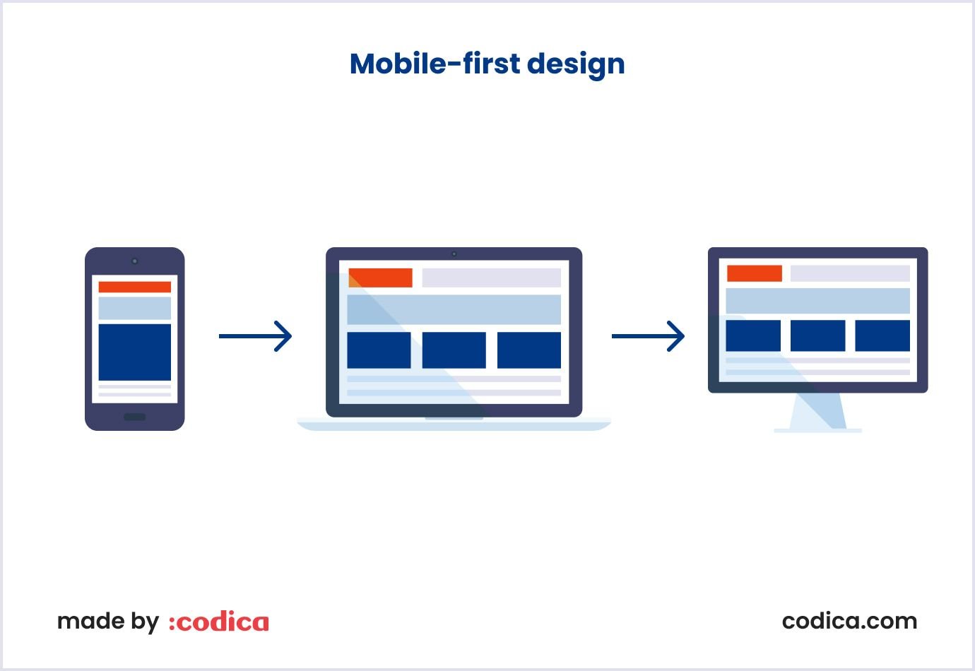
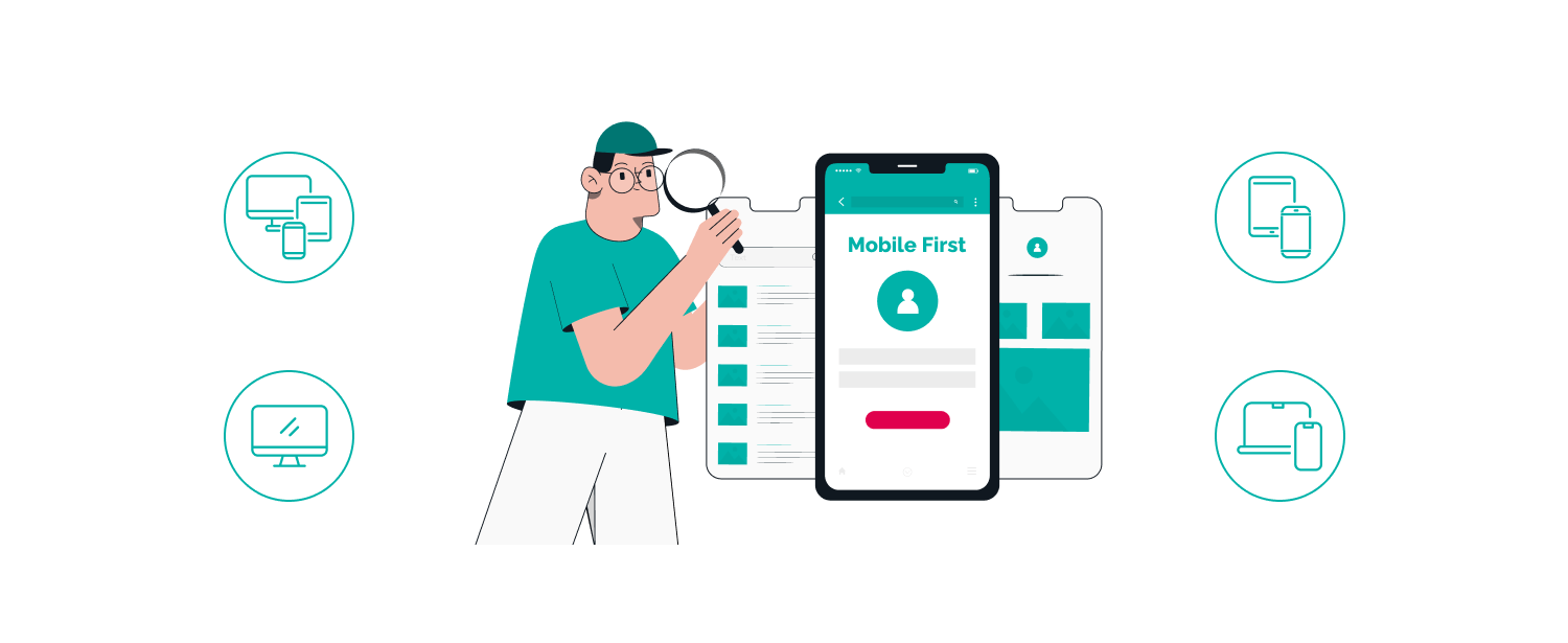
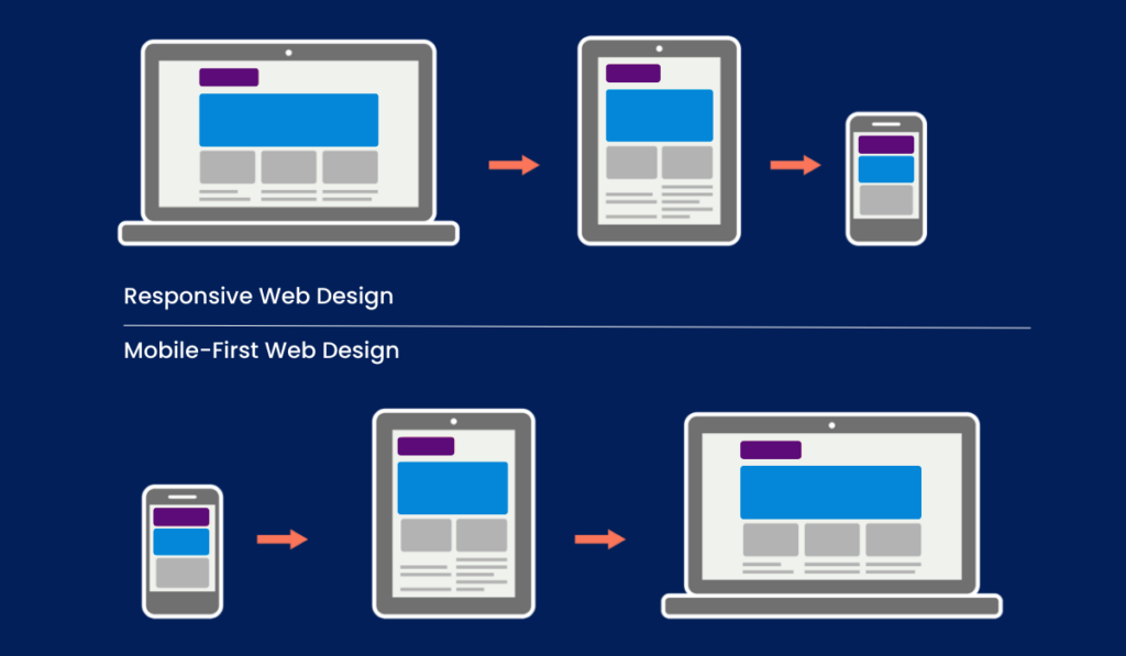
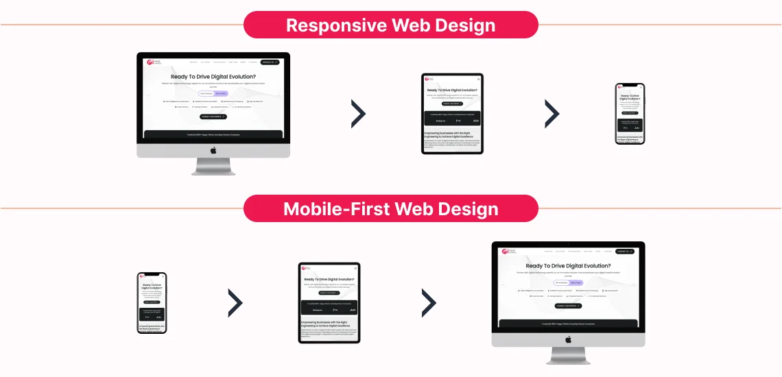
Mobile-first design is an approach where websites or applications are designed starting with the smallest screen size—typically mobile phones—and then scaled up to larger screens like tablets and desktops. This method prioritizes the mobile user experience, ensuring the design is optimized for mobile devices first before adapting to bigger screens.
Why Mobile-First Design Matters
- Improved User Experience: Mobile-first design focuses on essential content and features, creating a smoother, more intuitive experience tailored to mobile users' needs.
- Faster Load Times: Since mobile devices often have slower internet speeds and less processing power, designing for mobile first leads to faster loading times across all devices.
- Better SEO Performance: Search engines like Google use mobile-first indexing, so optimizing for mobile improves search rankings and visibility.
- Scalability and Cost Efficiency: Starting with mobile forces prioritization of core content, making it easier and more cost-effective to scale designs up to larger screens without clutter or unnecessary elements.
- Broader Accessibility: Mobile-first design enhances accessibility by using legible fonts, high contrast, and touch-friendly elements like larger buttons, benefiting users with disabilities.
- Consistent Cross-Platform Experience: It ensures a uniform user experience across devices, from mobile phones to desktops.
How to Implement Mobile-First Design
- Prioritize Content: Identify the most important content and features users need on mobile and focus on delivering those first.
- Simplify Navigation: Use clear, minimal navigation suited for small screens, such as hamburger menus or bottom navigation bars.
- Optimize Performance: Minimize file sizes, use efficient images, and reduce unnecessary scripts to ensure fast loading on mobile networks.
- Design Touch-Friendly Interfaces: Make buttons larger and interactive elements easy to tap, reflecting mobile usage patterns.
- Enable Easy Communication: Incorporate mobile-friendly communication tools like live chat, quick messaging, and simple review or rating systems to engage users effectively.
- Test Across Devices: Use tools and real-device testing to ensure the design works well on various screen sizes and resolutions.
- Progressively Enhance for Larger Screens: After the mobile design is solid, add enhancements and additional features for tablets and desktops without compromising the mobile experience.
Mobile-first design does not mean ignoring desktop users but rather ensuring the mobile experience is seamless and then expanding from there. This approach aligns with current user behaviour trends where mobile internet usage dominates and supports better business outcomes through improved engagement and conversions.
In summary, mobile-first design matters because it creates faster, more accessible, and user-focused digital experiences that perform well across all devices. Implementing it involves focusing on essential content, optimizing performance, and progressively enhancing the design for larger screens.


WebSeoSG offers the highest quality website traffic services in Singapore. We provide a variety of traffic services for our clients, including website traffic, desktop traffic, mobile traffic, Google traffic, search traffic, eCommerce traffic, YouTube traffic, and TikTok traffic. Our website boasts a 100% customer satisfaction rate, so you can confidently purchase large amounts of SEO traffic online. For just 40 SGD per month, you can immediately increase website traffic, improve SEO performance, and boost sales!
Having trouble choosing a traffic package? Contact us, and our staff will assist you.
Free consultation